In this tutorial we will discuss about effectively using diagnostic plots for regression models using R and how can we correct the model by looking at the diagnostic plots.
In the last article R Tutorial : Residual Analysis for Regression we looked at how to do residual analysis manually. R by default gives 4 diagnostic plots for regression models. IN this article we will look at how to interpret these diagnostic plots. We will use the same data which we used in R Tutorial : Residual Analysis for Regression . The data set can be downloaded from here INCOME-SAVINGS . You need to convert the excel to csv before creating model.
Lets first create the model.
income = read.csv("INCOME-SAVINGS.csv")
linearmodel = lm(SAVINGS ~ INCOME , data = income)
# Change the layout to 2x2 to accommodate all plots
par(mfrow=c(2,2))
par(mar = rep(2, 4))

# Diagnostic Plots
plot(linearmodel)
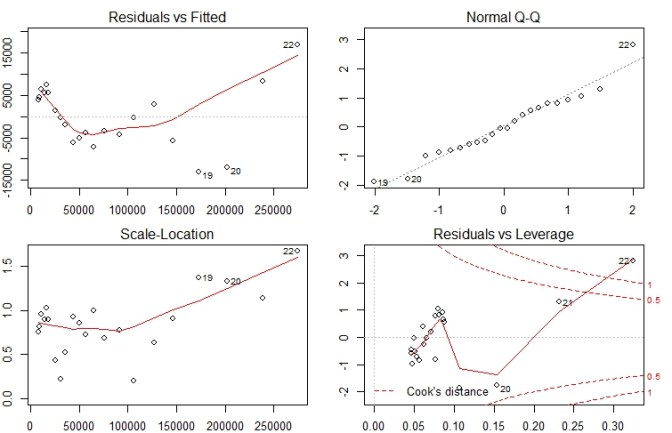
Lets now look at analysis of each of these plots individually
Residuals vs Fitted Plot

- This plot shows error Residuals vs fitted values.
- The dotted line at y=0 indicates our fit line.
- Any point on fit line obviously has zero residual. Points above have positive residuals and points below have negative residuals.
- The red line is the the smoothed high order polynomial curve to give us an idea of pattern of residual movement.
- In our case we can see that our residuals have curved pattern. This could mean that we may get a better model is we try a model with a quadratic term included. We will explore this point further by actually trying this to see if it helps.
Normal Q-Q Plot

- The Normal Q-Q plot is used to check if our residuals follow Normal distribution or not.
- The residuals are normally distributed if the points follow the dotted line closely
- In this case residual points follow the dotted line closely except for observation #22
- So our model residuals have passed the test of Normality.
Scale – Location Plot

- Scale location plot indicates spread of points across predicted values range.
- One of the assumptions for Regression is Homoscedasticity . i.e variance should be reasonably equal across the predictor range.
- A horizontal red line is ideal and would indicate that residuals have uniform variance across the range.
- As residuals spread wider from each other the red spread line goes up.
- In our case till approx 100000 or data is Homoscedastic i.e has uniform variance and later it becomes Heteroscedastic.
Residuals vs Leverage Plot
Before attacking the plot we must know what Influence and what leverage is. Lets understand them first.
Influence : The Influence of an observation can be thought of in terms of how much the predicted scores would change if the observation is excluded. Cook’s Distance is a pretty good measure of influence of an observation.
Leverage : The leverage of an observation is based on how much the observation’s value on the predictor variable differs from the mean of the predictor variable. The more the leverage of an observation , the greater potential that point has in terms of influence.

Now that we are clear on what Leverage is lets analyze our leverage plot draw inferences.
In this plot the dotted red lines are cook’s distance and the areas of interest for us are the ones outside dotted line on top right corner or bottom right corner. If any point falls in that region , we say that the observation has high leverage or potential for influencing our model is higher if we exclude that point.
Its not always the case though that all outliers will have high leverage or vice versa.
In this case observation #22 has high leverage and we have 3 choices
Choice 1 : Justify the inclusion of #22 and keep the model as is
Choice 2 : Include quadratic term as indicated by Residual vs fitted plot and remodel
Choice 3: Exclude observation #22 and remodel.
We will try both Choice #2 and Choice #3 and see what kind of diagnostic plots we get
Model after inclusion of Quadratic term
linearmodel2 = lm(SAVINGS ~ I(INCOME^2) + INCOME, data = income)
summary(linearmodel2)
<Output:>
Call:
lm(formula = SAVINGS ~ I(INCOME^2) + INCOME, data = income)
Residuals:
Min 1Q Median 3Q Max
-10304 -2027 252 2149 10352
Coefficients:
Estimate Std. Error t value
(Intercept) -5.936e+02 2.485e+03 -0.239
I(INCOME^2) 8.561e-08 1.579e-08 5.423
INCOME 2.187e-01 1.494e-02 14.644
Pr(>|t|)
(Intercept) 0.814
I(INCOME^2) 3.12e-05 ***
INCOME 8.39e-12 ***
---
Signif. codes:
0 ‘***’ 0.001 ‘**’ 0.01 ‘*’ 0.05 ‘.’ 0.1 ‘ ’ 1
Residual standard error: 4709 on 19 degrees of freedom
Multiple R-squared: 0.9968, Adjusted R-squared: 0.9965
F-statistic: 2968 on 2 and 19 DF, p-value: < 2.2e-16
#Diagnostic plots
plot(linearmodel2)
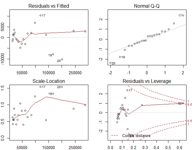
In this case our diagnostic plots are much better Residuals are almost horizontal and well spread. Spread is almost uniform and no point has excess leverage. Q-Q plot however shows that few points are not along Normal line. But that may be acceptable.
We will check another model without quadratic term and excluding observation #22
Model without high leverage observation
#exclude #22
income2 = income[1:21,]
linearmodel3 =  lm(SAVINGS ~ INCOME, data = income2)
summary(linearmodel3)

Output:
Call:
lm(formula = SAVINGS ~ INCOME, data = income2)

Residuals:
   Min     1Q Median     3Q    Max
 -8601  -3585  -1088   4294  15186

Coefficients:
              Estimate Std. Error t value Pr(>|t|)
(Intercept) -8.693e+03  2.064e+03  -4.211 0.000473 ***
INCOME       2.861e-01  5.693e-03  50.253  < 2e-16 ***
---
Signif. codes:
0 ‘***’ 0.001 ‘**’ 0.01 ‘*’ 0.05 ‘.’ 0.1 ‘ ’ 1

Residual standard error: 5837 on 19 degrees of freedom
Multiple R-squared:  0.9925,	Adjusted R-squared:  0.9921
F-statistic:  2525 on 1 and 19 DF,  p-value: < 2.2e-16

#Diagnostic plots
plot(linearmodel3)

All the plots do not seem fine in fact they are worse than our original model.
So far the model with quadratic terms seems to have fared the best in terms of our analysis of diagnostic plots. So we can recommend the model with Quadratic term.
Hope you have enjoyed reading the short tutorial. Keep learning and keep sharing !
Other similar articles of interest
Tutorial : Linear Regression Construct
Tutorial : Concept of Linearity in Linear Regression
R Tutorial : Basic 2 variable Linear Regression

There appears to be an improper code fragment in the code for your second model and its test:
summary(linearmodel2)
<span style="color: #ff0000;">Output:</span>
Call:
lm(formula = SAVINGS ~ I(INCOME^2) + INCOME, data = income)
I believe that the code “<span style="color: #ff0000;">Output:</span>” may be a hold-over from some other analysis, or perhaps just an error of inclusion.
Am I incorrect?
LikeLike
Thanks. It was added due to incorrectly formatted HTML.
I have corrected that.
Thanks for pointing out
LikeLike
Diagnostic plots provide checks for heteroscedasticity, normality, and influential observerations.
LikeLike